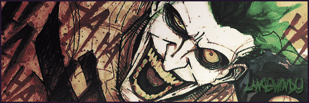
Here is the sex..., though on the KMC Dark, the white pixels bother me. Couldn't get em away. Maybe I'll have Baka show me how he gets such perfect .gifs.
(please log in to view the image)
Attachment: starwarssex.gif
This has been downloaded 74 time(s).
I finding it hard to decide.
so I'll just point out what i liked and disliked about each sig.
Mist:
Overall i liked the design. The only major problem i can see, comes from the use of Transparencies. It's left a stray pixel at the top and alot around the edges of the X-Wing's gun. these problems could have been avoided with the use of some sort of background, also i dislike seeing images cut off when a tranparency is used (the X-Wing's lower right wing). But Still a very good sig.
Ken:
Also a very nice design. Tranparency is use nicely you also have the white pixel problem but is has not shown itself as much as in Mist's.Although initially i couldn't make out what was in the middle (my bad eyes).
If the Death Star and space were bit more distinguisable it'd be great.
My decision is...
i cant make up my mind so i quit!!!
Kidding... I'll give this one to Ken. But this was very close.
I'd probably would have gone for Mist if he didn't use the transparency at the bottom.
btw i dont think i get my Transparencies perfect, it's more of luck

 KMC Community Forums


 Feb 1st, 2006 03:17 AM


 Couldn't get em away. Maybe I'll have Baka show me how he gets such perfect .gifs.