Gender: Unspecified Location: One for the other hand
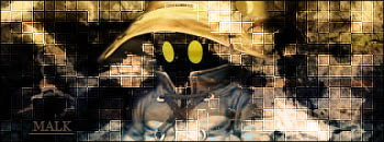
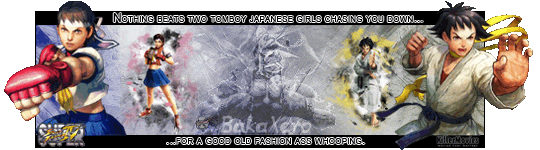
Malkavian.Blood (please log in to view the image)
+ Background blends well with the render, color seems to be right on as well as matching the texture of the render.
- The text looks like it is just thrown in and doesn�t really fit into the design which takes away from the overall look of the image.
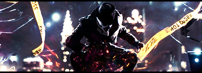
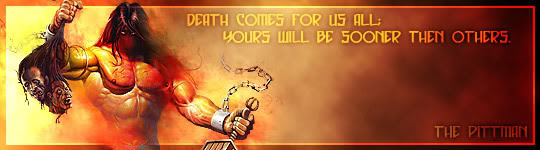
Barker (please log in to view the image)
+ Very unique and creative way of using the render, a color and design that I didn�t expect.
- Not really fond of the white bar in the middle
- The cloud/smoke over the render is a bit thick and distracting IMO
Well I had a few more issues with Barker�s design than Malk�s but the creative use of the render and design of Barkers I think put it over the top for me. While Malk�s was well balanced and a solid design expect for the text I enjoyed Barker�s creative use of the render in the design. If it wasn�t for the text on Malk�s I would give the win to him but the winner of this duel is Barker.
I couldn't fit the text in, no matter how many different ways I tried it, so I just went with what you could see. Styles, color, font, nothing I had would show up on it >_<

 KMC Community Forums


 Nov 15th, 2007 01:25 PM