|
Tassie
Senior Member
Gender: Female
Location: |
^^can you please not post unnecessary comments in the challenge thread? please
|
 Apr 16th, 2004 07:42 PM
 |
|
|
| |
|
LadySlytherin
LadyBaron
 Gender: Female
Location: tied to the darkness... |
^_^ sorry tassie!
__________________
SLYTHERIN PREFECT
it is n o t our dreams that show .[what].[we].[trully].[are]. ...it is, our c h o i c e s
S L Y T H E R I N B A R O N N E S S
|
|
Apr 16th, 2004 07:50 PM |
|
|
| |
|
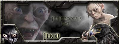
Thorondor
Love?
 Gender: Male
Location: Scotland |
ok i done the marking thing but it was screwed up so i will have it dont tomorrow 
__________________
A God Among Geeks
|
|
Apr 16th, 2004 07:59 PM |
|
|
| |
|
angelsflame265
la la la lalaaaa
 Gender: Female
Location: lost in hogwarts :) |
hey could we make this a note so it sticks? cause sometimes nobody talks on here for a while and dowwwwwwwwwn it goes
__________________

Offical Country Music Lover of Ravenclaw
|
|
Apr 16th, 2004 09:04 PM |
|
|
| |
|
Tassie
Senior Member
Gender: Female
Location: |
we'll need to ask Phoe
but i don't think making it a sticky's really necessary... i don't know..
|
|
Apr 16th, 2004 09:11 PM |
|
|
| |
|
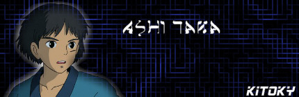
Kitoky
Starting Anew
 Gender: Female
Location: Imladris |
Do we score now?
__________________
Thank you so much Eezy!!
I'm starting over, do not mistake me for my brother - he has left. Eezy has convinced me to come back, give him some credit.
|
|
Apr 17th, 2004 03:28 PM |
|
|
| |
|
RebelPhoenix
I work in mysterious ways
 Gender: Female
Location: United Kingdom |
GRYFFINDOR'S RATINGS:
In order by which entries were posted:
HUFFLEPUFF
Entry 1
Originality and Creativity
Ok, being original and creative is about thinking outside of the box, thinking past what you are supposed to do and giving something extra. As far as I can see, this Hufflepuff sig is the only one with a background that is actually somewhat related to theme, even if it's not Hufflepuff specifically putting Hogwarts there is something unusual in comparison to the other entries. Also, I like the font, it's cute, frinedly and bright just like the character of Hufflepuff itseself. Other then that the name, crest and mascots are all present a long with a couple of fleur de lis.
Resolution and Clarity
This sig is not crystal clear like some of the others, it is perhaps because the background is a drawing rather then a digitally made photograph and the badgers also look hand drawn whether they are or not, the same with the fleur de lis and even the crest. That's not negative in the slightest for it gives an overall effect of the mist/dusk of the night and it is evening in the picture which give sit ambience but in this category it's not as sharp as it could be.
Following Instructions
According to Tassie's original post the only real pre-requisite was to have the house symbol in the sig. Hence this sig meets that requirement.
Last edited by RebelPhoenix on Apr 17th, 2004 at 09:42 PM
|
|
Apr 17th, 2004 09:38 PM |
|
|
| |
|
RebelPhoenix
I work in mysterious ways
Gender: Female
Location: United Kingdom |
Good Use of Colours
I like this sig's of colours, it's serene but then lifted with the vibrant yellows and that pattern is uniform throughout with no clashes or monotony - Yellow is a great colour for Hufflepuff signifiying their personality and in keeping with the black and yellow of the crest the entire sig follows suit. Even the fleur de lis and the background match in perfectly especially as the lights of Hogwarts enhance the overall glow.
Entry 2
Originality and Creativity
This is a beautifully charming sig, it's very original and elegent especially in contrast to the other House entry. As that one was dark this one is light, with sunshine cascading onto the desceased and he is sitting on teh grass which represents a sense of peace and contemplation, even the single flower adds to the moment. This is definitely the most creative out of the sigs imo because it's based on an important moment of the history of the house, something that affected everybody rather then the typical formula of House colours, crest and mascot. The change in font is good, the only issue I have with it is that this moment might not be relevent always and it does not define the House, rather it commemorates then represents hence it will not always be immediately relevent.
Resolution and Clarity
The background and font are clear, the image of Cedric could stand to be a little clearer I think and the crest doesn't look as if it was resized clearly enough.
Following Instructions
The crest is there.
__________________

Official Gryffindor Lawyer
|
|
Apr 17th, 2004 09:40 PM |
|
|
| |
|
RebelPhoenix
I work in mysterious ways
Gender: Female
Location: United Kingdom |
Good Use of Colours
The black and yellow is follow through on his blazer, it was very fitting to find a picture of him in his Quidditch apparel which is what he was mainly known for in his so called defeat against Harry that one time - the yellow is also followed through in the font and matches well with the sunshine in the background.
Overall SCORE
Originality and Creativity: 6.5/8
Resolution and Clarity: 2/3
Following Instructions: 1/1
Good Use of Colours: 3/3
TOTAL MARK: 13/15
Last edited by RebelPhoenix on Apr 17th, 2004 at 09:44 PM
|
|
Apr 17th, 2004 09:42 PM |
|
|
| |
|
Kitoky
Starting Anew
Gender: Female
Location: Imladris |
*sniffs*
Thank you so much man....
__________________
Thank you so much Eezy!!
I'm starting over, do not mistake me for my brother - he has left. Eezy has convinced me to come back, give him some credit.
|
|
Apr 17th, 2004 09:54 PM |
|
|
| |
|
RebelPhoenix
I work in mysterious ways
Gender: Female
Location: United Kingdom |
GRYFFINDOR'S RATINGS: Part 2
SLYTHERIN
Originality and Creativity
I like this sig, it's a parody much like my own personal sig and it's very in tune with the whole Slytherin attitude of tension between themselves and Gryffindor. I also like the way that it's animated, which was an idea I also came up with for my own House but it never came to fruition hence in comparison to all the sigs it is original because of the format used. Also the touch of the wand in between the two slogans acts as a transitional phase alongside with the effect rather just blanly changing from pic to the other and don't worry - I did notice the animated blood dripping from the serpents tongue 
Resolution and Clarity
THis is a very clear sig, the only things that aren't as sharp as the rest are the crests - again that hand drawn effect rather then digital creation, I'm not saying that they weren't originally made on computer just that they appear alittle blurry and could of stood to be made sharper with the re-sizing.
Following Instructions
Check.
Good Use of Colours
Hard to go wrong with this one really, all I can say in addition is that the green energy from the wand is very appropriate.
__________________
Official Gryffindor Lawyer
|
|
Apr 17th, 2004 10:26 PM |
|
|
| |
|
RebelPhoenix
I work in mysterious ways
Gender: Female
Location: United Kingdom |
Overall SCORE
Originality and Creativity: 6/8
Resolution and Clarity: 2/3
Following Instructions: 1/1
Good Use of Colours: 3/3
TOTAL MARK: 12/15
__________________
Official Gryffindor Lawyer
|
|
Apr 17th, 2004 10:28 PM |
|
|
| |
|
RebelPhoenix
I work in mysterious ways
Gender: Female
Location: United Kingdom |
GRYFFINDOR'S RATINGS: Part3
RAVENCLAW(sorry, I realised that you poseted before Slytherin but by then I'd already posted their results.)
Entry 1
Originality and Creativity
The background is stunning, very bold and eye ctaching from the first moment. However, it's not directly relevent to the House or school but I will take into consideration the fact that it follows House colours. Other then that, every thing is spaced out nicely avoiding clutter, the eagle is prominent, the font is legible and the crest is present. In terms of originality and creativity though, imo it seems that it sitcks to the typical formula without any variation and a suggestion that I would of made is that perhaps trying something different and using an actual raven instead or in addition to the eagle would have made it more innovative.
Resolution and Clarity
It's crystal clear, the only thing I would say is that the crest could have been either abit bigger or sharper.
Following Instructions
Check.
Good Use of Colours
The blue and white of the background fits in perfectly with the blue of the House colour and the white of the eagle, the white shadow on the font is also appreciated.
 |
|
Apr 17th, 2004 10:55 PM |
|
|
| |
|
RebelPhoenix
I work in mysterious ways
Gender: Female
Location: United Kingdom |
Entry 2
Originality
Stunning, simply stunning. It has so much in it without clashing, the mascot, the verse, the motif and the crest. I like the way the eagle isn't as bright as the other sig, like in the hufflepuff contrast Ravenclaw also has one bright and one dark. That motif is awesome, I love the way it have the names and actual bird talons - very original and creative.
Resolution and Clarity
Ok, alot of things with this one - the resolution is as sharp as can be so no problems with that and I don't know if you added a transparent effect to the central part of the eagle's face on a photo editor or something but it certainly looks that way and adds to the visial appeal of it especially against the subdued back drop. My issues with this one however is with the clarity - I had a little trouble reading the verse, it's legible but difficult to see clearly, I realise that you were trying to fit in in properly with the other objects but the size and font sacrificed the clarity. The crest is sharp but maybe too sharp due to the resizing that made the name actually less clear then the other sig's one but then again it blends in with the overall clarity of the sig. The motif - again due to the sizing I didn't realise what it was until I really looked at it for a while and then remembered seeing the full sized one in your thread before - if it had been bigger it would have been beyond cool, because it actually spells Ravenclaw.
Following Instructions
Check.
__________________
Official Gryffindor Lawyer
|
|
Apr 17th, 2004 11:12 PM |
|
|
| |
|
RebelPhoenix
I work in mysterious ways
Gender: Female
Location: United Kingdom |
Good Use of Colours
Black was definitly a good choice to use because of the sheer amount going on in this sig, however, I think it could have stood to be dark blue as well which would have worked in the House colours. But other then that black is always chic and works in well with all of the white.
Overall SCORE
Originality and Creativity: 6.5/8
Resolution and Clarity: 1.5/3
Following Instructions: 1/1
Good Use of Colours: 3/3
TOTAL MARKS: 12/15
__________________
Official Gryffindor Lawyer
|
|
Apr 17th, 2004 11:20 PM |
|
|
| |
|
RebelPhoenix
I work in mysterious ways
Gender: Female
Location: United Kingdom |
GRYFFINDOR'S RATINGS:
GRYFFINDOR
Entry 1
Originality and Creativity
This sig, similarly to Ravenclaws second sig had alot going on with many icons symbolising different things and avoids clutter. Firstly, the crest unlike the other sigs is the centre piece and it is held up by the mascot of the House but also by an actual Gryphon which is something original and creative in that it goes with the actual House name rather then just the mascot. The overall effect of this now seemingly double crest is that it looks like royal crest or one from a house of nobility - which gives it a kind of medieval authenticity. Moving on, the name is present in an equally flourishing font and Godric Gryffindor's sword is present in both corners heightening the representational feel of Gryffindor in total. Again, it all adds to make it look regal and important - the background is not necessarily directly related to the House but the House colours in a fiery feel and works with the other pictures in the sig.
Resolution and Clarity
The crest and background are clear but the swords could definitely stand to be made sharper and preferably with a more metallic sheen to make them more noticeable to blend in with the knight's helmet. Overall I think the whole sig could be made alittle clearer/sharper to give it a more polished feel.
Following Instructions
Check.
__________________
Official Gryffindor Lawyer
|
|
Apr 17th, 2004 11:56 PM |
|
|
| |
|
RebelPhoenix
I work in mysterious ways
Gender: Female
Location: United Kingdom |
Good Use of Colour
The fiery background works very well with the crest, the lion and the Gryphon - the reds, oranges and yellows - the only issue I have is with the colour of the font - like the swords I think it would have stood to be more metallic looking.
Entry 2
Originality and Creativity
This sig is much like the first Ravenclaw entry to me, in that is sticks to the typical formula without variation. It does has a stunning background that is eyecatching but unlike the Ravenclaw one it doesn't use House colours and takes up too much space distracting from the directly related elements which are too small in comparison. However, even though the background stands out it still has a calm feeling to it which matches the lions expression but the crest doesn't really stand out too much from it due to the similarity in shade (dark purple and dark red). The font however is gorgeous and the colour is just right - I think it could have been bigger though in order to fill the space better.
Resolution and Clarity
It is very clear, everything is legible and the crest is clearer then many of the other sigs.
Following Insructions
Check.
__________________
Official Gryffindor Lawyer
|
|
Apr 18th, 2004 12:10 AM |
|
|
| |
|
RebelPhoenix
I work in mysterious ways
Gender: Female
Location: United Kingdom |
Good Use of Colours
The dark colours all work together with the light font which gives it balance and like two of the other houses Gryffindor also went with the light and dark contrasts. The dark purple even works well with the dark part of the lion's mane.
Overall SCORE
Originality and Creativity: 6.5/8
Resolution and Clarity: 2.5/3
Following Instructions: 1/1
Good Use of Colours: 2/3
TOTAL MARKS: 12/15
__________________
Official Gryffindor Lawyer
|
|
Apr 18th, 2004 12:14 AM |
|
|
| |
|
RebelPhoenix
I work in mysterious ways
Gender: Female
Location: United Kingdom |
GRYFFINDOR TOTAL MARKS LIST
1 extra point for the first entry, 1 point per entry per house and 1 point deducted for every late entry.
Hufflepuff
Originality and Creativity: 7/8 (not 6.5, it was too late to edit before)
Resolution and Clarity: 2/3
Following Instructions: 1/1
Good Use of Colours: 3/3
TOTAL MARK & Extra Marks: 13/15 + 1 + 2
Slytherin
Originality and Creativity: 6/8
Resolution and Clarity: 2/3
Following Instructions: 1/1
Good Use of Colours: 3/3
TOTAL MARK & Extra marks: 12/15 + 1
Ravenclaw
Originality and Creativity: 6.5/8
Resolution and Clarity: 1.5/3
Following Instructions: 1/1
Good Use of Colours: 3/3
TOTAL MARKS & Extra Marks: 12/15 + 2
Gryffindor
Originality and Creativity: 6.5/8
Resolution and Clarity: 2.5/3
Following Instructions: 1/1
Good Use of Colours: 2/3
TOTAL MARKS & Extra Marks: 12/15 + 2
__________________
Official Gryffindor Lawyer
|
|
Apr 18th, 2004 12:23 AM |
|
|
| |
|
RoguePw25
Hogwarts Headboy
 Gender: Male
Location: Degrassi Street Moderator |
Huffelpuff #1
originality and creativity = 6/8
I thought that the fact that is was drawn, shows a lot of creativity. The effort was defiantly made. This was defiantly creative and I think the added pics of students made this sig original.
resolution and clarity = 2/3
The entire sig could be a bit clear. The boy towards the far right is kind of faded. The crest itself is a drawn, which is good, but the outline of the crest (in black) could stand out a little more)
following instructions = 1/1
good use of colours = 1/3
it�s a bit dark. Too much black. I think you could have used more colors besides black and yellow.
Huffelpuff Entry #2
originality and creativity = 7.5/8
Again, the drawn crest makes this sig original. The crest is a good size. The background of castles also has a certain appeal to it. The fog around the moon is very much presentable and I like it.
resolution and clarity = 2/3
the words are pretty clear. The little black and white animals on each side could be a little clear. I�m guessing that they are whales? I dunno, could be wrong.
following instructions = 1/1
the houses name is present and so is the crest
good use of colours = 3/3
I�d have to say that the midnight, moonlight theme is really working in this sig. The fog surrounding the moon is not too much, nor too little. Again, the name Huffelpuff, is in a good size font and is clearly readable. The little lights in the castle adds an extra effect to the overall moonlight theme. The use of yellow is elegantly used.
Entry #1: 10/15 +1= 11/15
Entry #2: 13.5/15
__________________
 Learn from yesterday...
Live for today...
Hope for tomorrow...
Last edited by RoguePw25 on Apr 18th, 2004 at 03:28 AM
|
|
Apr 18th, 2004 03:26 AM |
|
|
| |
Forum Rules:
You may not post new threads
You may not post replies
You may not post attachments
You may not edit your posts
|
HTML code is OFF
vB code is ON
Smilies are ON
[IMG] code is ON
|
|
Text-only version |
|
|

 KMC Community Forums