|
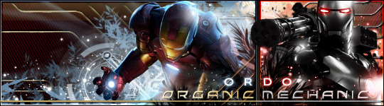
Ordo
Enforcer of the Republic
 Gender: Male
Location: Kamino Boot Camp |
Yessir!...no prob...I'll see what I can cook up!
__________________
|
 Mar 26th, 2006 01:20 AM
 |
|
|
| |
|
tlbauerle
thestarwarsfan
 Gender: Male
Location: Kearns, Utah |
Thanks!
I think this sets a precident, at least the 'single' releases all need to have that 'hand drawn / limited colour / artistic' look. I just think its incredible. The style is great.
I'd be interested in how you would stylize the 'suite' covers. Then for the actual Jewel cases perhaps using a more 'traditional' style. Can't wait!
__________________
|
|
Mar 26th, 2006 02:30 AM |
|
|
| |
|
Ordo
Enforcer of the Republic
Gender: Male
Location: Kamino Boot Camp |
Ok..version 2.0 and yes I'm giving it a full upgrade
Items changed:
Used official prequel STAR WARS header
Changed Font to a more classically styled font
Upgraded "Symphony for a Saga" to match the shiny gold of the header
Changed "Jedi Master: Qui-Gon Jinn's theme" to brown font
Added font transparencies to blend more with the background
Reworked some lightsaber glow
Added light glow around regions of Qui-Gon that should have been effected by a backlight
So, hows 2.0?
And I agree it definately seets a precedent for the singles, but I'm still not sure what I'm going to do about the full episode albums.
btw, I liked your suggestion of blue/silver, i chose not to because it often represents sickliyness and decay. Silver looked nice too, but i wanted to keep open the possibility of using larger color schemes for future covers. The gold works well, and it works with his character.
__________________
Last edited by Ordo on Mar 26th, 2006 at 05:03 PM
|
|
Mar 26th, 2006 05:00 PM |
|
|
| |
|
Ordo
Enforcer of the Republic
Gender: Male
Location: Kamino Boot Camp |
I always forget to attach! 
 Attachment: epsidoe i single - quigon 2 gold.jpg Attachment: epsidoe i single - quigon 2 gold.jpg
This has been downloaded 284 time(s).
__________________
|
|
Mar 26th, 2006 05:01 PM |
|
|
| |
|
tlbauerle
thestarwarsfan
Gender: Male
Location: Kearns, Utah |
Dude...we're gettin' there. I love the SW Logo...and the colouring looks great.
Can we decrease the size of 'Symphony for a Saga' so the lightsaber blade goes between 'for' and 'a'?
The font for the title is okay, but italicized it actually looks pretty pixelated. Do you have any others that look clean and sharp italicized. I actually prefer the previous font for the title as compared to this.
And perhaps dial back the green glow just a bit on his hands. Its a bit too overpowering instead of a highlight.
I'm still blown away by the idea, and how you pretty much nailed it right away. Hate to be a pill in asking for revisions...but thanks!
__________________
|
|
Mar 26th, 2006 10:26 PM |
|
|
| |
|
Ordo
Enforcer of the Republic
Gender: Male
Location: Kamino Boot Camp |
No problem, if I'm going to do something, I want it to be good. It's more your project than mine...
__________________
|
|
Mar 26th, 2006 10:35 PM |
|
|
| |
|
Ordo
Enforcer of the Republic
Gender: Male
Location: Kamino Boot Camp |
Fixes:
<> moved quigon 10px right (you originally had suggested shrinking the font. It did not look good, it lookse better this way opening up to the picture below (we have to keep it for 5 more singles) so I just moved Qui-Gon over)
<> took it easy on the green glow
<> fixed a pixely issue with the mist surrounding QuiGon
<> enhanced light
<> redid text to match title style (i originally kept it gold, but it was so light it was hard to see, so i did gold and brown, if you'd like me to change colors that isn't a problem
<> changed all non STAR WARS font
Any more suggestions/changes/fixes lemme know
CHEERS! 
{When its done, I'll give it to you in EPS format, it better that way w/o JPEG encoding}
Attachment: episode i single - qui gon 3.jpg
This has been downloaded 270 time(s).
__________________
Last edited by Ordo on Mar 27th, 2006 at 01:24 AM
|
|
Mar 27th, 2006 01:18 AM |
|
|
| |
|
tlbauerle
thestarwarsfan
Gender: Male
Location: Kearns, Utah |
I love everything...with exception to the 'Title' font.
The 3D is distracting. I love the shadow, keep the shadow. What other font styles do you have that may work? I'm just not in love with it.
Plus, just by my eye...it seems the logos on the top of the image are right of center, is that so or is it just my eye.
(People like me is the reason I don't do graphic art that much for other people....you wouldn't believe the hastle I went through with this book cover: www.lindaalicedewey.com)
__________________
|
|
Mar 27th, 2006 03:26 AM |
|
|
| |
|
Ordo
Enforcer of the Republic
Gender: Male
Location: Kamino Boot Camp |
Thats OK, its the joy of contract art....  ... ...
If you find a font that you like, lemme know, I'll put together a font sampling tomorrow afternoon. I'll do something simpler, but still a little more than straight up black. I may bring the text more into the background.
Oh and good call on the centering...redone...I also already cleaned up some fading issues.
__________________
|
|
Mar 27th, 2006 04:19 AM |
|
|
| |
|
Ordo
Enforcer of the Republic
Gender: Male
Location: Kamino Boot Camp |
Ok...hopefully I've been getting a better feel for what you want. Subtle, yet classy...
I had this idea and tried it...see what you think. if not, THEN i'll try the font sampling...this is actually my favorite so far.
comments, please...don't be afraid to knock it where you see fit.
Attachment: episode i single - qui gon 3.jpg
This has been downloaded 260 time(s).
__________________
|
|
Mar 28th, 2006 02:00 AM |
|
|
| |
|
tlbauerle
thestarwarsfan
Gender: Male
Location: Kearns, Utah |
Not too bad....
...The font is pretty cool, but the color is too difficult to see. Also, having "Qui-Gon Jinn's Theme" tucked next to the 'J' is cool...but jetting out on the right looks off balance.
I feel you're not completely satisfied yet either...so let's have those fonts.
Everything else is perfect!
__________________
|
|
Mar 28th, 2006 05:22 AM |
|
|
| |
|
Ordo
Enforcer of the Republic
Gender: Male
Location: Kamino Boot Camp |
Ok...heres a list. I put colored dots next to them so you can more easily reference fonts like..."oh. I really like 3 Yellow etc"
As for the color, i like it light and i think it fit smore with the backgorund. I wouldnt mind grying it up a bit though
The main thing is to find a font you like, i have 20 here and they are fairly representative of stuff that I think you and I have been heading for. keep in mind its no trouble to change spacing/letter height to width ratio. (ie i can easily change dimensions of a letter to make it shorter or thinner or whatever) (and don't worry about postitioning, I'll work that out on the actual cover.) The main thing we are looking for is fot style.
whatda'ya think
Attachment: font sample.jpg
This has been downloaded 268 time(s).
__________________
|
|
Mar 28th, 2006 08:35 PM |
|
|
| |
|
tlbauerle
thestarwarsfan
Gender: Male
Location: Kearns, Utah |
I certainly think 'greying' the title up will help, but also don't want to blend into the shadow too much. But you are right, the lighter it is the more it fits with the background...
Now for the fonts, I really like:
RED 3
There are quite a few that are similar to the last one you did, and most of those I like as well, especially after tweaking the positioning. Let's take a look at that one I highlighted above and see how that works.
In addition can you slightly darken the "Composed by..." line? Just a bit more to make it easier to read.
Thanks!
__________________
|
|
Mar 28th, 2006 09:07 PM |
|
|
| |
|
Ordo
Enforcer of the Republic
Gender: Male
Location: Kamino Boot Camp |
ok...this could be it.
Attachment: episode i single - qui gon final.jpg
This has been downloaded 252 time(s).
__________________
|
|
Mar 29th, 2006 05:11 AM |
|
|
| |
|
tlbauerle
thestarwarsfan
Gender: Male
Location: Kearns, Utah |
Suck...
Anyway to format it so that 'Qui-Gon Jinn's Theme' fits nicely under 'Jedi Master' like it did on the sample?
Maybe even by simply putting a little space in between the letters of 'Jedi Master'?
In addition, it looks a bit pixellated. Is this 72dpi or 300dpi? Perhaps rendering the text in a slight 3D can help with that.
ALMOST...if those things can be fixed.
__________________
|
|
Mar 30th, 2006 12:13 AM |
|
|
| |
|
Ordo
Enforcer of the Republic
Gender: Male
Location: Kamino Boot Camp |
Sure...I'll work on that.
Hopefully next time I'll be able to gague what you want faster...lol
Unfortuantely its 144 dpi. Excluding episode II, most of the photos available are small and low rez. If I had made it any larger, Qui-Gon would have been much smaller (an awkward) this wont be some much of a problem with II and III, but it becomes a HUGE problem with IV, V, VI because there are almost NO high rez shots available (for vey obvious reasons).
__________________
|
|
Mar 30th, 2006 12:39 AM |
|
|
| |
|
tlbauerle
thestarwarsfan
Gender: Male
Location: Kearns, Utah |
Makes sense....
Thanks!
__________________
|
|
Mar 30th, 2006 10:10 AM |
|
|
| |
|
Ordo
Enforcer of the Republic
Gender: Male
Location: Kamino Boot Camp |
You know the drill...
Attachment: episode i single - qui gon final.jpg
This has been downloaded 217 time(s).
__________________
|
|
Mar 30th, 2006 08:42 PM |
|
|
| |
|
tlbauerle
thestarwarsfan
Gender: Male
Location: Kearns, Utah |
SWEET!
One *last* thing...
Do you think if you decrease the size on the title a bit, it would improve the pixelation? Or is that just because it is an italics font? If so, is it not pixelated when it is un-italicized?
__________________
|
|
Mar 30th, 2006 10:30 PM |
|
|
| |
|
Ordo
Enforcer of the Republic
Gender: Male
Location: Kamino Boot Camp |
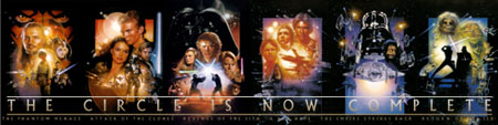
OK! this is primatily a sig/sig request forum...and I have a new sig today. Its temporarily back to Star Wars. I have recently been involved in a series of debates convincing people that both the the Star Wars Prequels and The Original Trilogy are good Star Wars films. Last year i combinded the republic and imperial logos into one joint venture, but this is the first time i have used the logo as the main body of a sig.
Long Live the Republic/Empire!
__________________
|
|
Mar 31st, 2006 07:43 PM |
|
|
| |
Forum Rules:
You may not post new threads
You may not post replies
You may not post attachments
You may not edit your posts
|
HTML code is OFF
vB code is ON
Smilies are ON
[IMG] code is ON
|
|
Text-only version |
|
|

 KMC Community Forums