Gender: Unspecified Location: One for the other hand
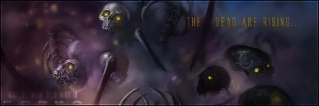
7-11 (please log in to view the image)
+ Good use of the render, though I would have like to see a larger design to use more of the render.
+ The text and logo are well done and time and though went into the design.
- The text blends into the background and makes it hard to read.
- The background is overpowering/busy and doesn't fit well into the theme of the image.
- The image over all is dark and no real focal point of the design.
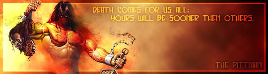
choosewisely (please log in to view the image)
+ I like the childish feeling to the design, its bright and refreshing.
+ I like the drawing of Spider-Man and brought more of the personality to design.
- The overuse of the outer glow is a bit overdone and looks like no real thought went into it.
- The background looks a bit pixilated and over stretched.
This is a tuff one because of the different styles and I like them both for different reasons but I do have to choose a winner to go into the next round so I pick 7-11. Great duel to the both of you and good luck in the next round.
i totally agree with the - points
my fould i didn't want to spent more tima at it.
it's hard tho to make something you like to see and i like to make because i totally hate everything about spiderman and stuff.
(i like the windwaker and that's the drawing style, to bad i ruined it with the outer glow)
maybe a tip for other judges to more specify the theme for the signature.
Gender: Unspecified Location: One for the other hand
That is the point of the first round is to live it open and you didn�t have to do anything with Spider-Man, I left it up to anything with Marvel. So you could have picked an artist, the company it self or any of their comic characters.

 KMC Community Forums


 Sep 28th, 2006 06:43 PM


 Nice.
Nice.