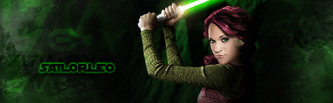
Really like the Lost and Dawn of Destruction, both have nice flow, but you should blend the text a bit, too distracting, lower the opacity in both and brighten "Lost" and try removing "Enidemic" (if that's what it says).
Also, sharpen your focal points. IMO, those two are the best you've ever made.
ya the epidemic one, was a gift for a friend, wouldn't of added the epi text if it wernt for that, also had alotta trouble getting the lost text to look the way i wanted
all of what you said taken in consideration
latest request (please log in to view the image)
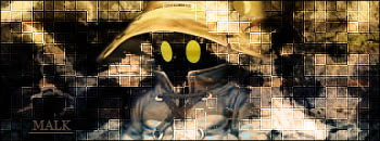
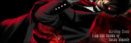
eh this one i definitely wouldnt of put text on if i didn't have to
had trouble finding any gradient maps, or ways of lessening the brightness, without it totally turning into crap
All I see improvement. The background's really cool, cool effects and wellplaced C4Ds, the text is definitely an improvement, not as distracting, but try an other gradient (something purple or red, or both) then lessen the opacity on both the texts.
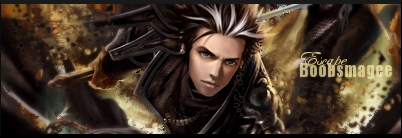
Crop about 20 pixels (or more) of the left side.
__________________
Last edited by Raijin on Dec 30th, 2007 at 12:52 PM
thanks guys
cropped (please log in to view the image)
i was thinking about keeping a few more pixels on the left, but i liked it cropped at 20 so i left it
leaving the text, dont feal like spending the effort to find the right colors
not sure where i got original bg been on my comp for almost a year, so if i find out not supposed to use or something ill just remove it
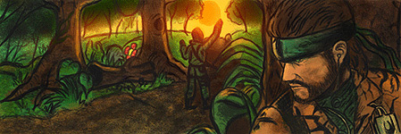
first real attempt at an lp, didn't come out entirely that great,
and doesn't even compare to many i have seen lol
but its my first so what the hay
reflection came out badly

 KMC Community Forums


 Nov 16th, 2007 04:26 AM


 and i sure can striding cloud