I should have specified that it was by my timezone but I'll allow this seeing as though I didn't give the full details. I'll check back when I finish work tomorrow.
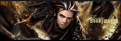
(please log in to view the image) boobsmagee: I like how this melds together, the misty/smokey background along with the semi-painted look really gels. I like the border and how it layers the sig. The textbox and the choice of text is well done but I think what's let you down in this is the sig's a bit cluttered imo and the resolution and your pixelation problem (which mind you could have been fixed if you'd given yourself time to).
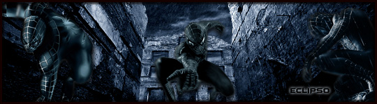
(please log in to view the image) Eclipso: I like the fact that you downsized the render for a more far-off look and extended it. The use of both the Mortal Kombat and 'Raiden' are extremely well done, (though it looks like you used Harry Potter text on that haha). The background's cool and so is the border, and I'm glad you didn't forget your name
I really like your work with this one, seems like you planned it out.
So all in all I think this was quite a close match but it comes down to artistry and care of the sigs so I'm sorry boobsmagee but ECLIPSO will win this one.
Thanks, It took awhile I made the thing from scratch, minus the MK sign and the render obviously. Although i did do the effects on and around them myself.

 KMC Community Forums


 Feb 2nd, 2007 12:13 PM