Gender: Unspecified Location: One for the other hand
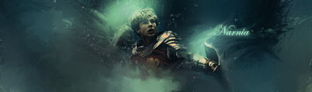
When two line touch each other or look like they do, with yours it is the �D� that comes to the bottom of the sig and touches the bottom line. What this does is create a focal point and lead the eyes off the image, if it was just below or above would help that issue.
I guess after going on my technique rant, I can't complain that much, but I don't think it was that egregious. I think its more valid to claim that the text is too bright in that area.
No. If you look at mine, the R clearly goes off, but the D just fell in the wrong spot. Its that one time offense that kills it.
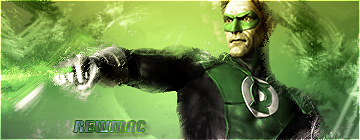
I feel your text is to distracting period. It should fade out in places to blend better. The two light sources are also distracting. And I'm not sure if the focal point is the glowing ball or his face. It looks flat and the face is blurry. But I do like the layout, color, and overall feel.
I think the movement should be focused on moving your eyes to a specific focal point. For example: Subtle lines going the direction of your focal point. This creates flow. With yours my eyes kinda jump and forth between the ball and his face. I wouldnt consider that good flow. The stuff on his arm and hands also needs work.

 KMC Community Forums


 Mar 8th, 2007 11:54 PM


 Are two focal points that complex? It creates movement.