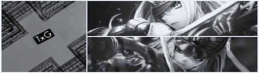
TxG Evil Genius Gender: Female
you have some awesome sigs here scythe __________________
11:45 AM
Scythe The Goat Gender: Unspecified
quote: (post ) Originally posted by TwilightxGirl
you have some awesome sigs here scythe __________________
11:52 AM
Jaeh Possibly here. Gender: Female
quote: (post ) Originally posted by Scythe I don't quite remember exactly what I did, since I made them and saved them as a PNG a loooong time ago, but I think I drew them, then took them and embossed them I believe, then add borders, emboss them again and play with the colors. Sorry, I really can't recall. Sometimes I like to draw random shapes on paint and take them on photoshop and see what I can do to them.
__________________ HIS force be with you.
01:15 PM
Scythe The Goat Gender: Unspecified
quote: (post ) Originally posted by Jaeh.is.Awesome
it's alright - maybe I'll try what you kinda did. __________________
04:41 AM
Scythe The Goat Gender: Unspecified
(please log in to view the image) (please log in to view the image)
__________________
08:43 AM
Scythe The Goat Gender: Unspecified
(please log in to view the image) (please log in to view the image)
__________________
07:02 AM
Scythe The Goat Gender: Unspecified
(please log in to view the image) (please log in to view the image)
__________________
07:34 AM
TxG Evil Genius Gender: Female
very nice sigs. I like how you did the text on your current sig your wearing. very cool
__________________
09:28 AM
Scythe The Goat Gender: Unspecified
quote: (post ) Originally posted by TwilightxGirl very nice sigs. I like how you did the text on your current sig your wearing. very cool
__________________
09:39 AM
Wanderer11 Stalker Gender: Male
Great work Scythe.
__________________ Thanks to Scythe for the sig and avatar.
03:36 PM
Scythe The Goat Gender: Unspecified
quote: (post ) Originally posted by Wanderer11 Great work Scythe.
__________________
08:05 PM
Scythe The Goat Gender: Unspecified
Requests have been PMed. Got em all done, f*ck yeah!
__________________
01:06 PM
MonoKid Junior Member Gender: Male
Nice work. I like the way you use color schemes and renders. Especially on how you tend to stick to two base colors. The renders are usually never obtrusive and you offer a focal point, which is usually the render or a name.
__________________
05:54 PM
Scythe The Goat Gender: Unspecified
quote: (post ) Originally posted by MonoKid Nice work. I like the way you use color schemes and renders. Especially on how you tend to stick to two base colors. The renders are usually never obtrusive and you offer a focal point, which is usually the render or a name.
__________________
09:51 PM
Scythe The Goat Gender: Unspecified
(please log in to view the image)
__________________
10:29 PM
Paola Ronin Gender: Female
Moderator
quote: (post ) Originally posted by Scythe
(please log in to view the image) (please log in to view the image)
__________________
05:11 AM
Scythe The Goat Gender: Unspecified
quote: (post ) Originally posted by Paola
thankuthankuthanku __________________
05:27 AM
Scythe The Goat Gender: Unspecified
(please log in to view the image) (please log in to view the image)
__________________
01:30 AM
Paola Ronin Gender: Female
Moderator
Here
aoa2006storm01.jpg This has been downloaded 44 time(s).
__________________
03:01 AM
Scythe The Goat Gender: Unspecified
__________________
Last edited by Scythe on Nov 9th, 2009 at 04:08 AM
04:05 AM
Forum Rules:
You may not post new threadsmay not post repliesmay not post attachmentsmay not edit your posts
HTML code is OFF vB code is ON Smilies are ON [IMG] code is ON
Text-only version

 KMC Community Forums


 Nov 1st, 2009 11:45 AM


 thanks. ^^


 you know how much I loved it!
 and those Mickey cuties you made for Kat are the loveliest thing I've seen... and the Wanderer sig also rules!

