|
Rarfu
Junior Member
Gender:
Location: Australia |
Rarfu sig
This is my first attempt at a sig, I need to know how to improve it. Any help is greatly appreciated.
(please log in to view the image)
|
 May 18th, 2009 12:09 PM
 |
|
|
| |
|
jboy4
*Im on another level
Gender: Male
Location: In the middle of ho where! |
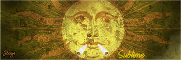
Effects are sweet for sure. But here this is wat u gotta do. Blend! There is no blending at all in this picture maybe the black boarder if u count it. Green background with a yellowish character with blue texts. You need to have a focal point but also have a blendin color with background to your stock image. The text needs to show out but also blend with these.
Awesome start for a first sig just work on blending hit some tuts then try again and ill see wat i can tell u from there.
__________________
|
|
May 18th, 2009 09:46 PM |
|
|
| |
|
Rarfu
Junior Member
Gender:
Location: Australia |
Ok thanks heaps that was exactly what I needed.
What colour combination do you recomend I should use with text and background?
I will get to work and post when i think it is better. Thanks heaps.
|
|
May 19th, 2009 05:52 AM |
|
|
| |
Forum Rules:
You may not post new threads
You may not post replies
You may not post attachments
You may not edit your posts
|
HTML code is OFF
vB code is ON
Smilies are ON
[IMG] code is ON
|
|
Text-only version |
|
|

 KMC Community Forums