Gender: Male Location: Maki
Affiliation: House Kreutz
^Then you have no taste.
From the fire to the epic placements of characters and the transparency of Batsu revealing his comrades locked in a struggle filled with death and teenage violence. Just epic!
__________________ By Saikyo Kid
Saikyo Ryu, LEARN IT!
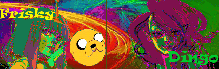
First one: Just because a bunch of people have been shoehorned into a limited space does not mean that effort was a good idea. The monochrome color scheme makes it worse, since no one is picked out and the whole mess just looks pointlessly busy. This is an attention-grabbing game cover, not a "Where's Waldo?" book.
Second: Uh... that dude seems to have a girl-shaped tumor on his face... and once again, monochrome.
Covers may have been good in the 90s, but you ought to pick better examples.
__________________
WARNING: The above post may contain sarcasm and/or sophisticated satire. Any psychological damage sustained is purely your fault.
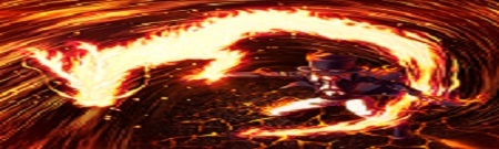
I don't care for the Arkham Asylum cover art because it's too monotone, there's too much mostly empty space in the background, and Batman just standing there glowering does not make for an interesting cover.
It's technically pretty well done, it's just also quite boring to look at.
Meh, it's boring. Of all the interesting characters in the game, they only put Batman on the cover? At least the Joker would have made for a nice addition. That and he is just standing there, which is rather dull for a lone cover person. At least InFamous' cover has Cole look like he is walking towards you.
That said, I still don't know what we're judging as a good cover.
Aside from instantly invalidating any and all subsequent argumets, no.
Anyway, there are worse games that did worse jobs on the same approach for worse reasons. No reason to bring up Arkham Asylum without mentioning Dante's Inferno, Bayonetta, Warrior Within, Yakuza 3, Ninja Gaiden Black, among others.
'Sides, it's still not as disappointing as God of War III's box art, which not only broke the tradition of an otherwise interesting consistency, but was done so for the stupidest reasons.
Last edited by BloodRawEngine on Apr 25th, 2011 at 01:43 AM
Arkham Asylum has more of a reason to be critiqued however as it is the only one that has actually been posted(I think?). Bayonetta is worse though, far worse.
lol Kratos' left eye is such an attention grabber and really does sell it huh?
Edit: Cover art really depends on the game and needs to be judged by those standards in my opinion. In that regard, I would rather have my fighting games have a lot of characters on the front to see my options. Or a fantasy game where I can see this strange fantastic world to explore. Or stuff.
Last edited by AuraAngel on Apr 25th, 2011 at 01:47 AM
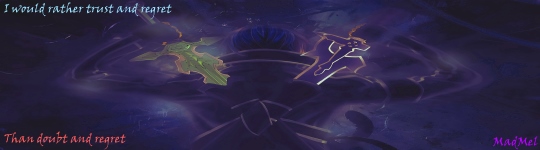
You want a good example of a "cast shot" fighter cover?
(please log in to view the image)
A large group of fighters present, but not mashed together in a confusing morass of colors. Each character is given enough space to show off for themselves a little, and the skewed camera angle and speed lines converging on a third line gives the entire scene a dynamic energy. While not perfect, the characters' posing and arrangement does a decent job of guiding the viewer's eye around the scene (from Pit down to Link, through Pikachu, Mario, and Samus to the title) and the color selection is altogether vibrant and eye-catching. It's not great, but it is very good.
And to their credit, there are no girl-tumor faces present.
__________________
WARNING: The above post may contain sarcasm and/or sophisticated satire. Any psychological damage sustained is purely your fault.
Gender: Male Location: Maki
Affiliation: House Kreutz
Is this some kind of joke?! Doom is not amused
That is quite honestly one of the worst, most boring covers of them all. You need to play more fighters, chap. For one, that sort of background is overused and looks rather cheap in this day and age. Next up, the art and style isn't really that good, looks like mediocre fan art. 3rd, the characters don't even look like they're drewn by the same person, the entire cover looks like a cut and paste job. Not to mention a painful lack of "epicness", the background's a bright light yet has no dynamic affects on the characters.
My covers have brilliant character placement and tell a snippet of the story. It let the consumers know who the heroes were and who the villains were. The colors are bright and sharp.
__________________ By Saikyo Kid
Saikyo Ryu, LEARN IT!
The characters in the SSBB cover look like they do in the game. They all originally come from different games with different art styles, and that fact was retained for SSBB's art style. And in fact the bright lighting of the background is reflected on the characters. See those shadows and highlights? Yeah.
Whereas a jumble of random characters, all colored the same, placed in such a way where if you're lucky you can see half a face, and a mediocre logo slapped in the middle covering up most of it...no, there's absolutely no way that's a good design at all. Nor is a bunch of faded images superimposed over a face; that looks like some newbie teenager just got Photoshop and is freaking out over being able to use layers.
A jumbled mess is not epic.
Seriously, this is basic stuff. Things you'd learn in any standard "art for beginners" class that everyone takes in high school.

 KMC Community Forums


 Apr 24th, 2011 03:27 PM