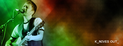
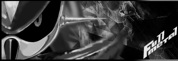
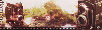
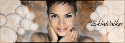
This is a grouping of some of my works. I will post the others in groups as I don't want any one post to be too long. So about 5 per post seems appropriate. I have many more on my host site, but these are the only ones I've resized to be usable here(the others are fine with dimensions, but the file size is much too large for this site).
Also, I do accept comments but ONLY if they are going to be useful. I don't want to see any of that 'lol itz cool' crap.
I will do requests, but only at my leisure.
If you have any questions about anything regarding the signatures or how they were made(teach a man to fish...) feel free to leave a comment about it or send me a PM.
The link to my photobucket site with my signatures and avatars is this. I keep it open so people can browse, but if I notice anyone running around with something they took I will close it right away. It happened once already with an image on the front page, but I wasn't too concerned as someone else may have actually taken the time to do the same thing.
These aren't signatures, but projects I made for my Photoshop class.
Carnage Wallpaper
It was brought to my attention by someone I showed this too that the eyes aren't supposed to be white and the mouth is supposed to be pink. Tough.
Boba Fett Wallpaper
I don't particularly like how this one turned out, but it's fine how it is. His symbol off to the side seems kind of out of place but once again, it doesn't matter.
I started roughly two years ago, however I only started using my currently style around a year ago.
The programs I use are Adobe Photoshop CS2 and Adobe ImageReady CS2. I am aware that Photoshop CS2 can make animations, but I much rather to use ImagReady which was created more for that purpose.
Very tech-ish. I enjoy tech brushes. And a lot of the stuff in the backgrounds is cool too (looks like grunge brushes to me, but I might be mistaken...I'm too lazy to download too many for myself). Others might be turned off by too much of the same thing (tech stuff), but I like your stuff.
I would say that you should try playing around with other styles a bit also, try messing with the blend modes on the tech brushes; they really are quite jarring on the lighter colored sigs.
Please read the first post next time.
------------------------------------------------------------------------
You're right on the grunge brushes. Good eye.
I would worry about what people 'liked' if I were making these for them. O:
I know what you're trying to say though, thanks~
------------------------------------------------------------------------
Yeah, I admit, I do a sloppy job on how I don't make them lighter over the dark spots or darker on the light spots. Something I do need to start paying attention to.
------------------------------------------------------------------------
I like it more too. I guess it just 'fits' better with itself than the others. *shrug*
If you're asking for a version that size, it wouldn't be a problem. You have to ask directly though.
Yeah, i didnt read itits too long...i still probaly wont read the first post anyway
anyway...the tech background really works with the sig you have now but not with the sigs like Nook and Samus...thats the most helpful im gonna get so...

 KMC Community Forums


 Dec 8th, 2006 09:09 PM


 also, try messing with the blend modes on the tech brushes; they really are quite jarring on the lighter colored sigs.

 its too long...i still probaly wont read the first post anyway
 so...
so...