Cool ripple effect as a background/border. I liked the quote. The simplicity worked well with the render (no color ). However, the text could have used some work, and the "M" was half cut off.
Barker -
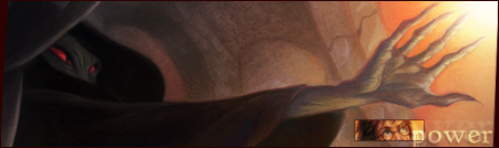
Awesome background, and great use of colors with a colorless render. The background was cool, looked like granite almost. I liked the way you made your text (Gradient?), however, the "Purple is greater than Silver" thing threw me off a bit.
Overall, both were cool entries, and very different. I'll have to give this one to Barker, though. His background matched the render better, and his text was very well crafted (What?). Mace=badass, your entry was good, nice and simple, but the text could have been jazzed a bit. Perhaps maybe a new font?
So congratulations to both of you, but Barker wins it!

 KMC Community Forums


 Feb 10th, 2006 09:46 PM


 ). However, the text could have used some work, and the "M" was half cut off.