+ Humour-y-ness (continues to giggle)
+ Concept/Application of the theme (still giggling)
- Text is just thrown in there
- Seemingly overall lack of effort (no border?!)
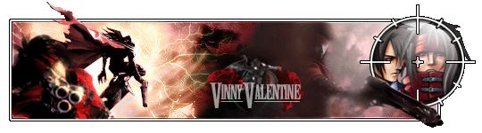
Funny sig, and a great idea.
Barker:
(please log in to view the image)
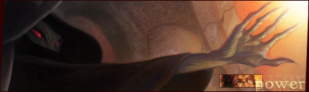
+ Concept (Just... cool. )
+ Nice use of the different images (Dark Mark, Death Eaters)
- Neville and the plant kind of seem a bit out of place
- Text (Blah...)
Cool idea, and a nice manipulation.
These sigs are very different, which makes it hard to judge. However, the one that I enjoyed more is... BARKER'S. It was more aesthetically pleasing and seemed to have had more effort put into it. Good job to both of you, and...

 KMC Community Forums


 Oct 1st, 2006 02:34 AM


 What a suprise!