Oh, here is a topic I could go on forever about...I rather frequently critique game covers when I'm at work 😛 It'd be much easier for me to talk about ones that I think aren't that great, though. I also look at things a bit differently; not only do I look at how nice the artwork itself is, but also how it stands up as a design and how well it fills the important elements of a design.
As far as being eye-grabbing, I think Borderlands is awesome for that. It's very brightly colored, the title stands out well against the background, and the image itself makes you do a double-take. There are also several elements that lead the eye directly to the game's title; always a good thing.
The first Portal - simple, with the only real color in the artwork being in the logo. The person going into the portal with the arrow pointing down at the title brings your eyes down to it quite nicely. Certainly better than the cover for Portal 2.
Assassin's Creed II - I like the contrasting between the deep red and white on it, and the mostly-dark background with Ezio set against it makes him pop out. The reds matching the red of the logo work nicely as well. I definitely like it better than the covers for the first AC (very bland, Altair does not really stand out much, and the blues don't work as well as the reds) and Brotherhood (a background of the multiplayer characters makes it seem too busy and Ezio does not particularly stand out).
The Japanese cover for FFX. I like the cover for the American release of the game, but like most FF games, the Japanese cover art is superior. This one stands out in particular, not just because it's my favorite game, but because of the design of the logo. The art surrounds the title, and the design of it brings your eyes around and back to the title. Set against a plain white background, it's just very simple and elegant, and not busy at all.
I tend to be not fond of covers that go the "epic movie poster" route, as I find that in such a small size it's just way too busy and there's too much going on, while at the same time there's not enough to really bring the eye where it should be; there also tends to be too much that just leads the eye off the cover which is not something you want at all.
And then there are some that are simply horrible.
I actually have no thoughts on the Super Metroid cover, it's solid for what it is and while it's not an amazing example of a design, it's also not bad. It doesn't commit any huge errors of design, other than being a bit busy.
The KOTORs, though, suffer from many problems. First and foremost is the fact that there's little to draw the eye in, and instead most of the elements of the artwork lead you off the edge of the design. That is very bad; if you're designing a cover for a book or DVD or game, the last thing you should be doing is making something that's going to lead to the case sitting next to it. The lightsabers, being so brightly colored, stand out hugely, and how they're angled sends you right off the edge. Malak's cape leads you down and off; HK stops that line and brings it back in a bit but then the alien shoots you right off the bottom again. The half-circle at the bottom seems like a half-hearted attempted at a stopping point but instead just looks out of place. Bastila standing slightly off-center like she is looks like they attempted to use the rule of thirds but didn't do a good job of it.
Now, if Bastila was centered and holding her lightsaber up, so that hers and Malak's sabers formed a 'v' shape that converges on her, with the alien at the bottom moved to the right side, and the entire design moved up a bit and the title moved to the lower half, then the design would be much more solid and interesting. The lines of the lightsabers would bring the eye in and down on Bastila, and there down to the title, which contrasts enough from the rest to act as a stopping point.
KOTOR2's cover art is a bit better as a design, but it still fails in several ways. First of all, Revan is off-center. The lightsabers again just pinball the eye around the image and then off the side. Darth Scabby (I can't remember his name) looks out of place at the bottom, as does the subtitle. And the same half-circle from the first cover is back, and has no purpose at all. I honestly have no idea where they were going with this one, and it really kind of puzzles me. So much of it just looks fine (for example, this time the ships bring your eye in to the title, and not off the edge), and so much is terrible. I think that if they had simply reversed the duel in the center so that Atris was on the left, not the right, it would have gone a long way to fix things, though obviously not everything.
Originally posted by Digi
Design elements aside (Peach! 😛 ), I like that Batman one.
What? I'm a graphic designer, and my dream job is to do cover art for video games 😛 It's impossible for me to look at anything like that casually, I have to give everything a critical eye and see where it works and where it fails 😛
Originally posted by Mist_haermm
All those fighting game covers are shit, just quietly.
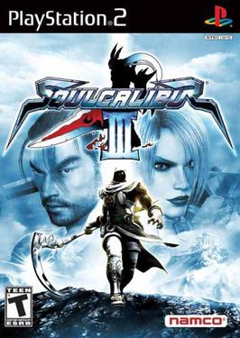
I'm inclined to agree; I don't think I've ever seen a fighting game cover that was actually any good (I think Soul Calibur III's is the best, and that one's only okay). They tend to fall into this trap of "must advertise the entire cast" which just makes the artwork far too busy and cluttered.