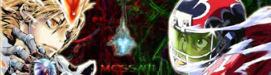
I normally don't do requests, and most of my sigs aren't saved as psd's anymore, to save hard drive space...so the versions with my name are all I have. I'll sift through what I have left and see, but you'll have to be patient.
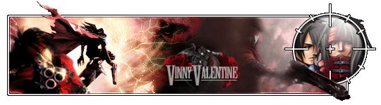
May make a matching avy if someone wants to wear it (with their own name inserted for Vinny's, obviously). I was going to offer it to Knightfall there, but he went and got himself banned.
I also have to download some new background files to use in sigs. I've been using the same 3-4 for my last 9-10 sigs. In different color schemes, sizes, effects, etc. of course. But still. It's been a lazy way to make decent looking signatures, but has made my style become kinda predictable.
So cafepress lets you make your own t-shirt designs, then sells them at not-too-expensive a cost. Technically you can make money off of selling them, but mainly it's just for making sh*t for yourself.
And I've decided I need new t-shirts. With custom designs. Hilarity and/or awesomesauce forthcoming in the next few weeks.
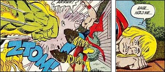
Animation still scares me, even though I know I'm capable of it myself. Nice work.
But I've been thinking about this shirt thing for days, and have hit artist's block bigtime. I keep trying to think of the most awesome thing ever, instead of just random designs that might be fun. Still. It shall happen.
t-shirt design has been a pain in the ass. My mind can't seem to wrap itself around the concept of not using a render as a focal point, and designing for a different size and medium. But it's coming along. I have a couple viable designs that I'm attempting to tweak right now, which will hopefully be completed within the week.
The fiddly bits around the edges aren't as noticable with the small-ish screenshot of the t-shirt, but I'm pleased with how it turned out.
To most it looks like a planet or sun, and that's actually the base image (Venus). But I tried to make it look like it was a portal opening up to a different dimension or something. Like a wormhole in my chest. I'd post the original image as a .png, but imageshack puts it on a white background which ruins the glow around the outside, so it just looks weird.
Note to others: t-shirt places usually only have a set number of colors to work with.
In particular, the "glow" affect from my design is plastered in shocking white. It looks, well, bad.
So yeah. Simple designs, with clear distinctions between colors and boundaries, work best. If anyone finds a more robust site, let me know. Until then, don't make the mistake I made.

 KMC Community Forums


 Jan 8th, 2009 05:31 PM


 FER TEA!!
 i get it