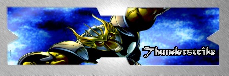
Thanks. I "discovered" the background by accident and loved it, and basically tacked the pic on as an excuse to use it as a sig. It works well enough with it, but the sig is meant to be as much about the bckground as the pic. I was thinking it would look cooler with a LOTR render or something similarly medieval-esque and epic, but I didn't have anything like that saved and didn't feel like looking for it. The megaman one seemed to fit the best among the images I have on my cpu.
Haven't been making many sigs lately...but this is for my brother's possible business (Flynn's II is one of the names he's batting around). It's like a 21st-century arcade, with a bunch of innovative designs and such. I stayed with roughly 450x150 because I'm comfortable with it, and he just wants some logo ideas and such. It's basically a rough-draft, but I like how it turned out.
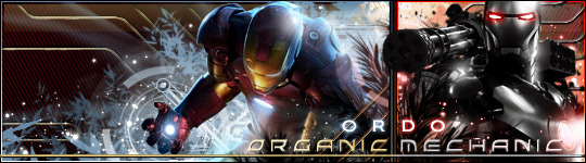
Not a sig....a new logo for my brother's business. He's actually just presenting the idea to people at this stage, it's not a certainty that it'll happen at all. But this is the title page on his Powerpoint presentation right now. I'll be tweaking it a bit, but the majority is here. Mostly just lots of game renders....though I touched up a few of them, and I'm working on a decent looking grid-effect to use in the background. ...could probably use a bigger border too.
...not sure if the raised-sig-over-darkness works, but it was somewhat of an experiment, and I think it turned out decent. I might switch Lana's name for mine and use this soon since I don't have many recent good-looking sigs.
8-9 now at dueling. I might just retire and save what dignity I have by making my own and being happy with them. But I'll be opening for requests in a few weeks...as soon as school's out, or shortly thereafter.
Anyway, not a sig, but a possible cover for a high school yearbook. I have a class that deals with advising student publications (like yearbooks) and we were asked to come up with a theme. The red/blue color scheme and the idea of "Touching All..." would run throughout the yearbook.
I don't know what the exact dimensions will be, so I might have to tweak it some, and the footprints might need a bit of work, but here it is...
My thanks (I think.. ), and I like the Spidey reference, but I still have a losing record (or even if I win that one). So I'm not sure if it's a testament to my mediocrity or just the magnificence of the sigmakers on these forums. Probably some of both.
I had a brainblast....a new sig-making purpose if you will.
I'm going to start making a sig out of the cover of every Amazing Spider-Man issue I get. And it will always be current, from the most recent one. I think it'll be fun....and so that's my next endeavor besides opening up to requests in a few weeks.
How I got a purple color scheme for anything involving Spidey is beyond me...this one just got away from me in a hurry and never really turned out like I wanted (cover isn't an action shot from 531 so it was hard). I tried incorporating pics of Tony and Cap that were on the cover too, but for some reason it either looked like Tony was missing an arm or that he was much too interested in Peter.
I might just try again...it's not a total loss, but I can do better.
I'll practice on some back issues too, just for fun...since it'll be a whole other month before I get a new one (this one just came today).
In the meantime....the first in the ongoing experiment.
...kinda like the first better. It's like Spidey's watching a montage of his past fights. They're both kinda big right now (circa 70KB) but I'll be bringing them down soon.

 KMC Community Forums


 Mar 24th, 2006 09:01 PM


 ), and I like the Spidey reference, but I still have a losing record (or even if I win that one). So I'm not sure if it's a testament to my mediocrity or just the magnificence of the sigmakers on these forums. Probably some of both.